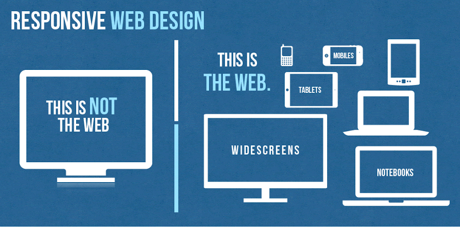
Responsive design is a website that is designed to ensure that the images, structure and content remain as usual in any device. The design ensures that users get full access to the site when using their phones or tablets smaller screen. This means that a person does not have to worry about having various websites, but to ensure that the sites functions effectively on the mobile device. Majority of the people in the world conduct Google searches on their phones. This means that one can get a good experience regardless of the device sizes and make.
According to Google analytics more that 30% of the website traffic is brought about by tablets and mobile devices. Additionally, 69% of the people that own tablets conduct their shopping on their devices every month. The trend is attracting many people and there is a likely hood that by 2015 web browsing will be conducted on the mobile devices as opposed to desktops.
Responsive design also gives users better and effective experiences. For instance users don’t have to keep zooming the images and the texts on their screens but instead the images in the screen are able to adjust automatically the device’s screen. This ensures that the users can navigate and the site easily. According to research people are likely to move to other websites if the site does not open completely.
However, when a person has a good experience on a specific website with their mobile websites they are likely to use the site effectively to buy products and services from it. An effective user experience further makes communication and feedback to be efficient. It is always important to ensure that the content is accessible in an easy way and it engages the users. A fully responsive website ensures this is achieved by making sure that the users view the site in the best appropriate format for any device being used.
A responsive website is easier to manage and very cost effective when conducting SEO campaigns as you only campaign for one website unlike in a situation where you would have to conduct separate campaigns for the desktop website and the mobile devices. It also ensures that you always stay ahead in the business as many users use mobile devices to search for commodities as well as make purchases. Time is also an important aspect that is saved because there is only one website to update, maintain and market.
This ensures time is saved and money. Responsive design increases the conversion rates, therefore, making the users happy. This is because if a website does not work on the mobile devices the users will not convert. Since a responsive design can easily adapt to any screen the developers have adequate control of all the elements that get displayed on the tablet and the phone. A responsive design also ensures that everything on the website has logical places that help visitors to find what they are looking for easily. In addition it makes sure that the main content on the page is visible without causing any strain. The site is unique and provides a visual sparkle to ensure that the customer enjoys reading the content.
Responsive design also ensures that you can carry out some high end A/B and heat mapping testing. This testing’s can be done easily by the use of software’s such as Optimizely and Clicktale. This ensures that segments user gain good idea of how the users are interacting on the website design services. This makes you to know the marketing strategies and the sales tactic that are effective and the once that are not effective. Responsive design has also been recommended by Google and actually Google prefers the design. The reasons that make Google to prefer responsive design is because it is very efficient for it to craw the site, index and then organize all its contents online.
This is because all websites have only one URL and they share the same HTML on all the devices. However, when a business has both the desktop site and a mobile site it will need to have different URL and different HTML for each. This in return forces Google to index different versions of the exact site. Moreover, Google prefers the responsive design because the content that is in only one URL and website is easier for the users to interact with, link to and share as opposed to content that is on a separate site. Optimizing segments for the mobile devices is very important as it plays a vital role in capturing conversions and visitors. This design is an effective cost effective way of optimizing sites as compared to creating separate sites for tablets, mobile and computer desktops.
Responsive design also plays an important role in helping combat the bounce rate that may be higher. Whether the website is better in search results or not the users are likely to bounce off it does not work efficiently on tablets and the mobiles. Website operators are likely to suffer from high bounce rates if they offer information that varies on their desktops and their mobile devices. A responsive design ensures that this problem is avoided by presenting the same content found on the desktop but in a more advanced functional way. This makes sure that the customers get the information they are looking for and keeps them on the page.
Responsive design websites are the best for users who traverse the internet by the use of their phones and expect to have a smooth desktop experience as well. Going responsive is the best way to ensure that visitors have the best experience on your site as well as make the most of tablet and mobile traffic. While going responsive comes with its challenges on the marketers as well as the website owners it is important to know that the future is on the mobile devices. In case you do not provide a mobiles — friendly environment for your esteemed customers they are likely to move to the competitors that own websites that are easy to operate and manage.
Summary
Responsive web design came about as a response to the growing popularity of portable Internet devices like mobile phones and tablets. An already fairly common and growing complaint from users of such devices was the “web’s” inability to adapt properly giving users a less-than favorable experience.
Now thanks to CSS3 and other developments users are able to enjoy their favorite websites and have access to their content on the go as well as at home. Websites are also able to serve their customers content where and when they need it, increasing ad revenue and traffic. In an increasingly mobile world you can expect to see more and more responsive web designs and, eventually, the difference between developing these and regular site will be no different.
Now let’s have a look on the several benefits of Responsive web design for your business.
- Drive traffic to your business from all kind of users using desktop, personal computer or any kind of mobile devices. It will increase the total percent of your business traffic by mobile audiences.
- Responsive web design for your business allow you to manage the complete website with one set of links which will as a result will increase your website visibility in all major kind of search engines including Google, yahoo and Bing.
- Improve in sales and conversion rates of your business — Responsive web design boost conversion rates which is the ultimate requirement of any kind of online business. Responsive Web design is also user and search engine friendly.
- Save time and money which is required on mobile website development.
- Responsive web design will attract more number of customers to your site and this will take your business to next level of success.